Prepare a Logo for Print: The Complete 7-Point Checklist
File format, size, colors, background, fonts, extra versions, a zoom check: the 7 things your printer will look at anyway, sorted before you send.
By Gaël Pons
Published , updated
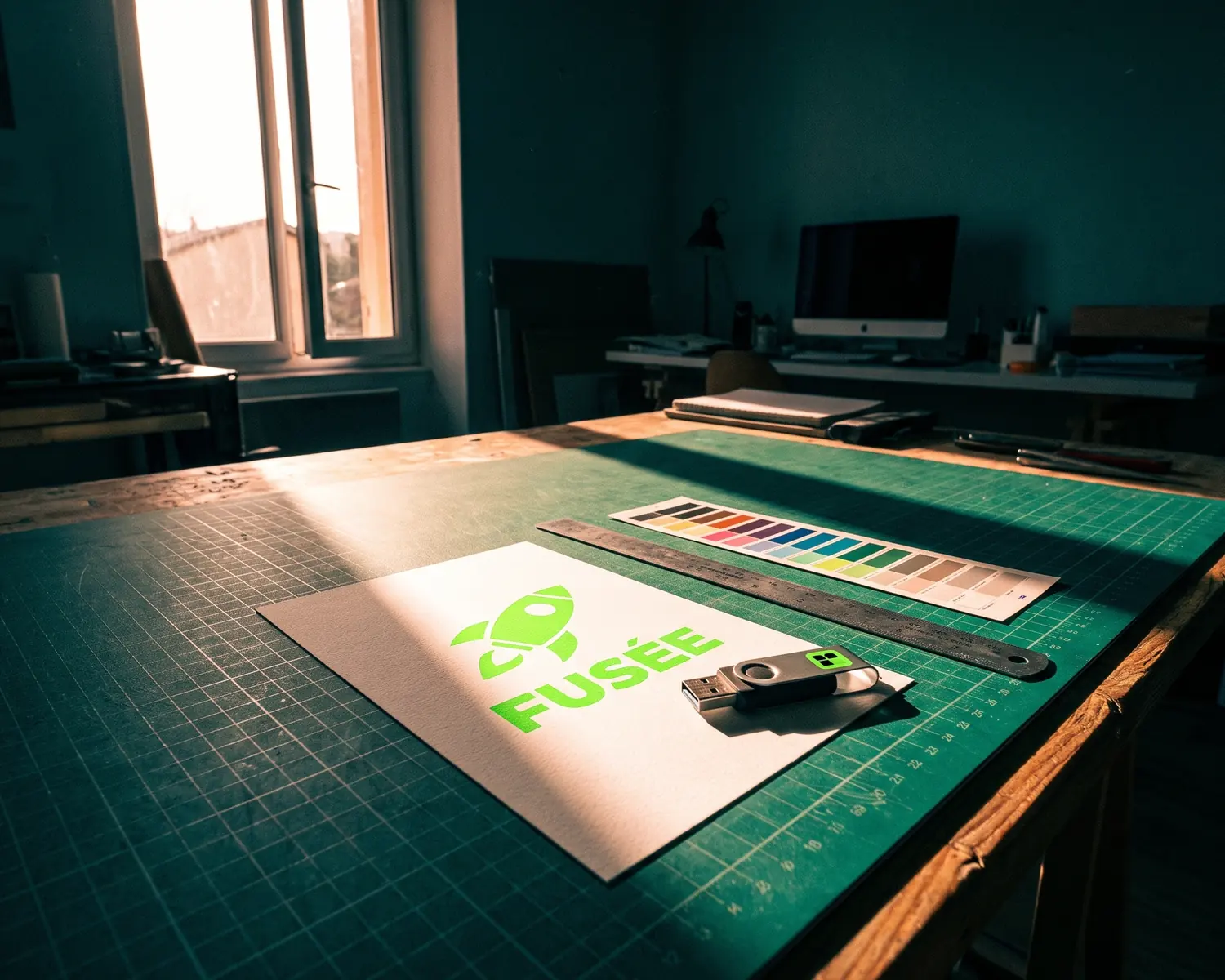
To prepare a logo for print, send a vector file (one that describes the logo as shapes, with no pixels at all) with a transparent background, text converted to shapes, a reference color and a one-color version. Your printer will check all of this anyway: do it first.
Below is the full checklist, in the order a print shop goes through it, with a link to a detailed guide wherever a point deserves one.
What should you check before sending a logo to print?
Before sending a logo to print, check seven things: the file format, the size, the colors, the background, the text, the extra versions and a final close-up look. Here they are as a list to tick off:
- Format: a vector file (PDF, SVG or EPS), never a screenshot.
- Size: if the shop accepts an image, enough pixels for the printed size.
- Colors: a written reference (CMYK or Pantone) if your brand color matters.
- Background: transparent, including inside the letters.
- Text: converted to shapes, so the font can’t be swapped at the shop.
- Versions: a single-ink version, plus a white one for dark backgrounds.
- Final check: a close zoom on the edges and the smallest text, right before sending.
Which file format does a printer need for a logo?
The file format a printer needs for a logo is a vector file: a vector PDF by default, SVG for apparel and vinyl cutting, EPS only when the shop insists on it. A JPG or PNG only exists at one size, the size of its pixels, while your printer has to scale the logo up or down for each product; some machines (embroidery machines, vinyl cutters, laser engravers) even follow outlines rather than dots.
Which format suits which product is explained in SVG vs EPS vs PDF. To understand what these files actually contain, read what a vector file is.
How do you know whether your logo is already a vector?
Your logo is probably a vector if the file ends in .svg, .eps, .ai or .pdf and stays perfectly sharp when you blow it up on screen. A PDF can still hide a plain picture of the logo, though: if the edges turn into little steps when you zoom in, it isn’t a vector. The reliable signs are listed in what a vector logo is.
What if your only logo file is a JPG or PNG?
If your only logo file is a JPG or PNG, get it vectorized: an online converter redraws the shapes in seconds, and a designer can rebuild it by hand when the original is too damaged. Of the two, a PNG is the better starting point, for the reasons laid out in JPG vs PNG for a logo.
When a vendor asks for “a high-res logo”, a vector file is often what they really want without naming it. Our guide to the high resolution logo translates the request into plain English.
What resolution does a logo need if the printer accepts an image?
If the printer accepts a pixel image of your logo, aim for 300 dpi at the actual printed size, the standard print shops use for anything seen up close. In practice, a logo printed 4 inches wide needs 1,200 pixels across (4 × 300). The math for any size is in what 300 dpi means. To skip it, drop the image into the DPI calculator: it shows how large the file prints sharp, and the image stays on your device.
Stretching a small file to more pixels adds no detail: the logo just comes out soft on paper. If that has already happened, why a logo looks blurry when printed helps you find the cause.
Which colors should you give: CMYK, RGB or Pantone?
Colors for a printed logo are given in CMYK, the ink-based mode, or as a Pantone reference when the exact shade matters to your brand. An RGB file, the screen mode, won’t be rejected: the shop converts it, but very bright greens and blues can come out duller (the reason, in CMYK vs RGB). Our RGB to CMYK converter shows the CMYK estimate of each color and warns you when it will print duller.
If you don’t know your logo’s Pantone number, finding your logo’s Pantone color takes only a few steps. Write it down once and keep it with your logo files.
How do you check that the background is really transparent?
A logo background is really transparent when, placed on a dark color, it shows no white box around the logo and none inside the letters. The test takes ten seconds: drop the file on a black presentation slide and look inside the “o”, the “a” and the “e”. A JPG always fails this test, because its white background is baked into the picture.
Why convert the text in your logo to shapes?
The text in a logo is converted to shapes before sending because live text depends on the font being installed on the printer’s computer: if it’s missing, their software quietly substitutes another one. Once converted, the letters become drawings like the rest of the logo and keep their exact look. In Illustrator, the command is Type > Create Outlines; in Inkscape, it’s Path > Object to Path. Keep a copy with editable text, since converted text can’t be retyped.
Which extra versions should come with the color logo?
Along with the color logo, provide a one-color version (a single ink) and a reversed version (white, for dark backgrounds). The one-color version is used for engraving, rubber stamps, one-color screen printing and single-thread embroidery; without it, someone at the shop decides on their own which areas merge. A logo with two similar shades can even lose its text once flattened to one ink, so look at the result before you approve it.
The white version is what saves a black t-shirt or a dark storefront: see how to get a white logo for dark backgrounds.
How do you check the file one last time before sending it?
To check a logo file one last time before sending it, view it very large, at 400% then 800%, on the spots that break first: letter edges, thin corners and the smallest lines of text. Three questions settle it. Are the edges smooth? Is there a white box left anywhere? Can you still read the smallest line? If one fails, fix the file now rather than after a round trip with the shop; the fixes for each flaw are sorted in how to improve logo quality. For a t-shirt, a hoodie or a tote bag, also place the logo in the free mockup generator: you see its size, placement and contrast on the fabric before you order.
Who prepares the file, you or the printer?
Preparing a clean logo file is your part of the job; the printer then adapts it to their equipment (scaling, color separation, export to their own format). They won’t redraw a pixelated logo, guess your brand color or remove a background for free: that kind of rework is usually billed, or it delays the order. The simplest move is to ask in writing what they accept before you order.
What belongs in a complete logo kit?
A complete logo kit holds five items: the vector file, a PNG with a transparent background, the one-color version, the reversed version and a note with your reference colors. Sent as is to every new vendor, it saves you the same hunt through old folders each time you order jerseys, business cards or a sign.
What if your only logo is a photo of a flyer?
A photo of a flyer, an old JPG someone emailed you years ago or a scanned sketch can all work as a starting point on Depixelise, a logo-to-vector converter that is 100% free, with no sign-up and no watermark. Upload the image, up to 10 MB, as a JPG, PNG, WebP or SVG: the background is removed, the shapes are redrawn, and you see the result full size, zoomable, right on screen.
Shoot the flyer straight on, in good light and without glare: the sharper the picture, the less the software has to guess. A very small image is enlarged and then rebuilt, which can round off a corner or alter a letter, so compare it with the original up close. An email brings you the SVG, a 2000 px transparent PNG, the one-color version and the reversed version: four of the five items in your logo kit, ready for the shop.
FAQ
What is a printer’s proof, and should you check it?
A proof is the preview the print shop sends you before production starts: by approving it, you accept the result exactly as shown. Check it zoomed in, text and colors included, because a mistake you signed off on is usually yours to pay for.
Does a logo need bleed?
No, a logo on its own doesn’t need bleed: that extra margin of a few millimeters (about an eighth of an inch) applies to documents printed edge to edge, like a flyer or a poster. If your logo touches the edge of such a document, it’s the whole document file that needs the bleed, following the shop’s instructions.
Can you prepare a logo for print without design software?
Yes, most of the steps work without design software. An online converter gives you the vector file and the transparent PNG, and a logo vectorized from an image already has its letters as shapes. A drawing program like Inkscape, which is free, only becomes useful if your file still contains editable text.
The printer is asking for the logo’s font: what should you send?
Send the font name if you know it, but above all a version of the logo with the text converted to shapes: the shop then no longer needs the font at all. A licensed font can’t always be passed on freely anyway, which makes the conversion the safer choice.
Does the same file work for print, embroidery and engraving?
The same vector file is the starting point for all three, but each shop then prepares it for its own machine: the embroiderer turns it into stitches, and the engraver often starts from the one-color version. Send the full kit and let each vendor pick the piece they need.