Improve Logo Quality: The Right Tool for Each Problem
Blurry, pixelated or rejected by your printer? What an AI upscaler, free vectorizing and a designer can each fix, and how to check the result.
By Gaël Pons
Published
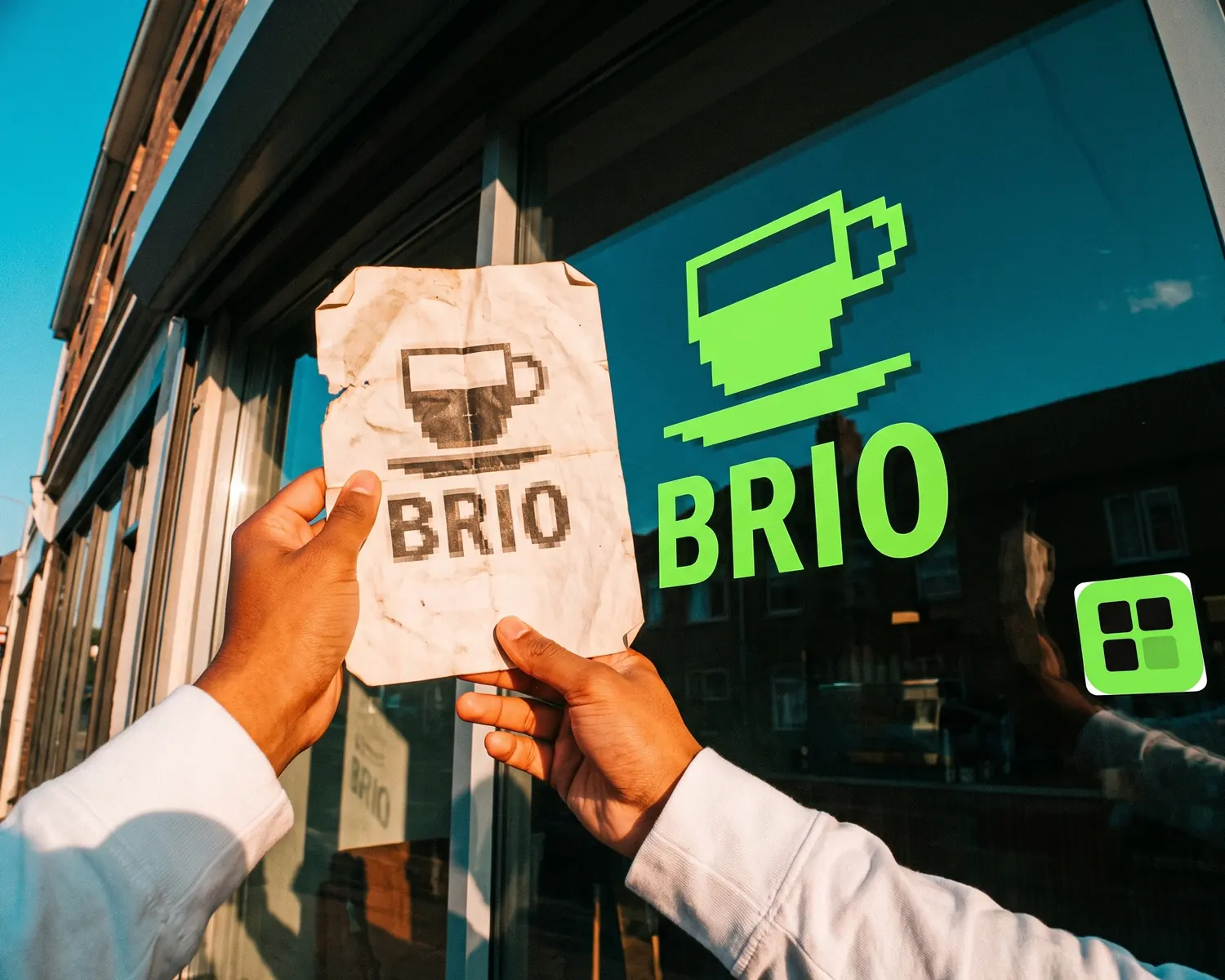
To improve logo quality for good, vectorize it: its tiny colored squares become shapes that stay sharp at any size, the format printers ask for. An AI upscaler polishes the image for screens, not for print. If the design itself feels dated, only a designer can rework it.
Why does a logo look low quality?
A logo looks low quality for one of three reasons: the file has too few pixels for the size you need, it has been saved as a JPG over and over until the edges got muddy, or the design itself falls apart at small sizes. The first two are file problems and can be fixed; the third is a design problem and needs a person.
If your logo just came back blurry from a print job, the step-by-step diagnosis (which product, which size, which file you sent) lives in why a logo turns blurry when printed. This page assumes you already know the symptom and want the tool that fixes it.
What tools can improve logo quality?
Four kinds of tools can improve logo quality: AI upscalers, vectorizing, manual editing and a designer. Each one fixes something different:
| Tool | What it changes | Screen | Print, embroidery | Cost |
|---|---|---|---|---|
| AI upscaler (Canva, iLoveIMG, Pixelcut…) | Adds pixels and guesses missing detail | Good | Not enough | Free or subscription |
| Vectorizing | Replaces pixels with shapes | Good | Good | Free online |
| Photo editor (Photoshop, Photopea, GIMP) | Cleans spots, corrects colors | Fair | Not enough | Free to paid, time-consuming |
| Designer | Redraws or modernizes the logo | Good | Good | Paid, quoted per job |
One question settles it: will this logo ever be printed, embroidered or engraved? If yes, only the two options that deliver shapes actually solve the problem.
Is an AI upscaler enough for a logo?
An AI upscaler is enough for a logo that only lives on screen at one fixed size: a profile picture, a website header, an email signature. It multiplies the pixels and fills in the gaps with educated guesses, so the image comes out smoother and cleaner than before.
But the file is still a grid of pixels, just a larger one. Stretch it again for a banner or a storefront sign and it goes soft, and a print shop that asked for a vector file will turn it down for the same reason as before. AI also sometimes invents a letter or a corner that was never there, so read your brand name back one letter at a time. For the difference between upscaling and real repair, see how to unpixelate an image.
How does vectorizing improve a logo?
Vectorizing improves a logo by rebuilding it: instead of storing a grid of little squares, the file stores shapes (outlines, curves, flat areas of color) the software can redraw cleanly at any size, from a favicon to a billboard. That’s a vector file: built from shapes, where a JPG or PNG is built from little dots of color. It has no resolution, its edges stay smooth from a business card to a box truck, and it’s the format printers, embroiderers and engravers ask for. What makes a logo “vector” in the first place is covered in what is a vector logo.
You’ll see the difference on three classic flaws of an old logo: stair-stepped edges vanish, the gray smudges JPG compression leaves around letters disappear, and the white box stuck behind the logo goes away. The full method, from choosing your starting file to the final format, is laid out step by step in how to vectorize an image.
Two limits to know up front. Fine gradients and texture effects come out simplified into a few solid colors, which suits embroidery but changes the look. And a very small file gets enlarged first and then redrawn, so a letter can lose a detail on the way: that’s why the zoom check below matters.
Can you improve a logo by hand?
You can improve a logo by hand in a free photo editor such as GIMP or Photopea: wipe out a stray spot, deepen a washed-out black, set a color back to its real value. That’s handy for one precise fix on a file that’s otherwise fine.
Hand editing doesn’t change what the file is, though: an edited JPG is still a JPG with the same size limit. It also takes patience and some practice. For a logo that’s blurry all over, starting again from a vectorized version beats fixing edges one pixel at a time.
How do you improve a tiny logo or one saved from a website?
To improve a tiny logo, first look for a better source, because no tool beats a good original. Three places worth checking, in this order:
- search your inbox for “logo”, “brand guidelines” or the name of whoever designed it: a bigger PDF or PNG is often sitting in an old thread;
- on your own website, right-click the logo and choose “Save image as”: if the file ends in .svg, your logo is already a vector;
- ask the print shop that did your last business cards, since many keep their customers’ files.
If all you really have is a 150-pixel thumbnail, vectorizing still works: the image is enlarged automatically, then its shapes are redrawn. On a simple logo the result is often clean; on small text or a busy crest, expect it to be less faithful.
See your improved logo full size, for free
On Depixelise, drop in your JPG, PNG or WebP (10 MB max): within about ten seconds the redrawn logo shows up large, right next to the one you started with. You zoom to 400% then 800% on the lettering and judge the result for yourself. Your inbox receives four attachments: an SVG your print shop can open, a 2000-pixel PNG with a transparent background, a one-color variant and a white variant made for dark garments. You pay nothing, since the tool is 100% free; you never open an account, and none of the four files is stamped with a watermark.
When should a designer take over your logo?
A designer should take over your logo when the problem is the design, not the file: a typeface that screams another decade, details that vanish below an inch, a symbol nobody understands. No converter and no AI fixes a design flaw.
A designer is also the right call for a highly detailed logo that comes out damaged from every conversion. Designers quote per job, and a logo your customers already recognize is often worth more than a trendy new one.
How can you tell the logo is really better?
A logo is really better if it passes three quick tests, done before you send it to anyone:
- The zoom test: open the file and blow up the edge of a letter as far as it goes. Smooth at every level means vector; stair steps mean it’s still pixels.
- The small-size test: shrink the logo to the size of a postage stamp. If the name is still readable, the design holds up.
- The dark background test: place it on black. A white rectangle popping up means a background is still attached to the logo.
What file should you send your printer once the logo is fixed?
Once the logo is fixed, send your printer the vector file (SVG, vector PDF or EPS) rather than a PNG, however large. If the shop only takes pixel images, the usual rule of 300 dots per inch at actual size is explained in what 300 dpi means. The full pre-flight checklist is in how to make a print-ready logo.
FAQ
How long does it take to improve a logo?
Improving a logo with automatic vectorizing takes about ten seconds, plus a few minutes of checking it zoomed in. Hand editing takes hours, and a redraw by a designer takes days.
Can you improve logo quality on your phone?
Yes, you can improve logo quality on your phone: upscalers and online converters run in the browser, no app needed. Just do the zoom check on a computer screen before sending, since fine flaws are easier to spot there.
Can the gray smudges around the letters of a JPG be removed?
Yes, those smudges come from JPG compression and disappear when the logo is vectorized, because every color becomes one clean flat area. An AI upscaler softens them but doesn’t always erase them, since it works on the same pixels.
Will improving my logo change its design?
Vectorizing keeps your logo’s design, but it can round off a corner or simplify a tiny detail, especially when the starting file is small. Always compare the old and new versions side by side, letter by letter.
Should you keep the old logo file?
Yes, keep the old file in a separate folder: it’s your reference for comparison, and a designer will need it if you ever have the logo redrawn. Name the new version clearly so the wrong one never gets sent again.