CMYK vs RGB: Which Color Mode Should Your Logo Use?
RGB is for screens, CMYK is for ink. Why a bright green prints dull, whether to convert the file yourself, and what to send your printer.
By Gaël Pons
Published
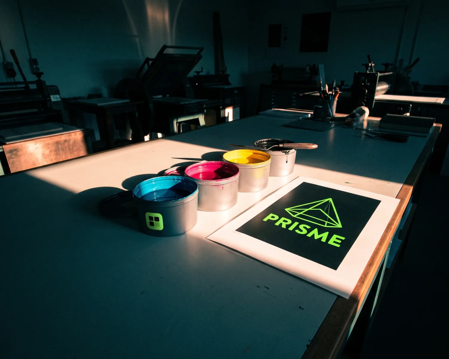
CMYK vs RGB comes down to where the logo will be seen: RGB (red, green, blue) is for screens, CMYK (cyan, magenta, yellow, black) is for anything printed in ink. Your logo needs both versions. Some bright screen colors don’t exist in ink, which is why prints can look duller.
What is the difference between CMYK and RGB?
The difference between CMYK and RGB is how each one makes color: RGB mixes light, CMYK mixes ink. A screen starts from black and switches on three tiny lights, red, green and blue; turned all the way up, they make white. A printer starts from white paper and covers it with inks that soak up part of the light; the more ink it lays down, the darker the result.
| RGB | CMYK | |
|---|---|---|
| Seen on | screens, websites, social media, slides | paper, apparel, signs, stickers |
| Makes color with | light | ink |
| Range of colors | wider, especially the vivid ones | narrower |
| Written as | a code like #1FA84F or three numbers | four percentages (C, M, Y, K) |
What do the letters CMYK and RGB stand for?
RGB stands for red, green and blue, the three lights inside every screen. CMYK stands for cyan, magenta, yellow and black, the four inks of standard full-color printing (often called four-color process). Black is the K, short for “key”. It gets its own ink because stacking the other three produces a muddy dark brown rather than a true black, and wastes ink on top of that.
Should a logo be in CMYK or RGB?
A logo shouldn’t be in CMYK or RGB alone: each of its colors deserves values in both modes. The RGB version goes on your website, social accounts and anything read on a screen; the CMYK version goes on business cards, flyers, signs and shirts. The shapes never change, only the color numbers do. To get those numbers, our RGB to CMYK converter gives a CMYK estimate for any code, and the image color picker finds every color in a logo. When a color has to match exactly on every material, a Pantone reference sits on top of both, as explained in our guide to your logo’s Pantone colors.
Why do colors look different when printed?
Colors look different when printed because ink can only reproduce part of the range a screen can display. When a shade has no CMYK equivalent, the conversion picks the closest one available, usually a little less bright. Nobody made a mistake: it’s a physical limit of ink on a surface.
Paper plays a part too. Matte, uncoated stock soaks up ink and makes colors look softer than glossy coated stock. The same file can come out slightly differently from two printers, or on two papers from the same one.
Which colors don’t survive the switch to CMYK?
The colors that suffer most in the switch to CMYK are the very bright, glowing ones: acid greens, electric blues, neon oranges and pinks, saturated purples. Soft tones, browns, grays and dark colors come through far better. If your logo relies on a “neon” shade, expect a visible gap and ask for a printed proof before the full run.
How can you tell if a file is CMYK or RGB?
To tell if a file is CMYK or RGB, open it in a design app: Photoshop shows the mode in the document tab (“RGB/8” or “CMYK/8”), Illustrator shows it in the title bar. Without software, a simple rule helps: a JPG grabbed from the web is almost always RGB, and a PNG can’t be CMYK at all. For picking between those two for screen use, see JPG vs PNG for a logo. An SVG also describes its colors in RGB.
Should you convert your file to CMYK yourself?
Converting your file to CMYK yourself isn’t always the right move: many printers would rather receive it as is and convert it with their own press settings. A conversion done with the wrong settings (the color “profile”) can dull your colors a second time. The safest step is to ask your printer what they want; if they ask for CMYK, they’ll usually name the profile to use (in the US, often a GRACoL or SWOP profile). Everything else to check before sending is gathered in how to prepare a logo for print.
How do you convert an RGB file to CMYK?
An RGB file is converted to CMYK in a design app by changing the document’s color mode. In Illustrator: File > Document Color Mode > CMYK Color. In Photoshop: Image > Mode > CMYK Color. After converting, look over the colored areas: the screen now gets closer to the printed result, so you can brighten a shade that went flat before sending. Always keep the original RGB file, because switching back to RGB won’t bring the lost colors back.
CMYK or RGB for a T-shirt or other apparel?
For a T-shirt, CMYK or RGB depends on the printing method far more than on the fabric. DTF and direct-to-garment printing often start from an RGB file that the machine converts on its own; screen printing and heat transfer vinyl use inks or films picked color by color, often by Pantone reference. On dark fabric, a white base layer goes down first. Either way, the question for the shop is the same: which mode do you want to receive?
Why does a vector logo make the switch from RGB to CMYK easier?
A vector logo makes the switch from RGB to CMYK easier because each color is a single value tied to a shape, which can be swapped in one click. In a JPG, the color is scattered across thousands of pixels, with stray shades along the edges, so changing it cleanly turns into a retouching job. That’s why printers ask for a vector file: a logo described by shapes rather than tiny colored squares, where they can apply their own CMYK or Pantone values without damaging anything. To pick between SVG, EPS and PDF, see which vector format your printer wants.
One file for every surface, from screen to ink
If your logo only exists as a JPG, Depixelise converts it and emails you four files, each made for a specific job. The SVG goes to your printer or embroiderer, who sets their own ink or thread colors on it. The 2000 px transparent PNG stays on the screen side, in RGB: website, social media, email signature. The one-color version handles single-color marking (stamps, engraving, one-ink prints), where the color mode question disappears entirely. The white negative version waits for dark backgrounds. No sign-up, no watermark, and it stays 100% free; still, zoom in on the result before sending it, especially if your starting image is small.
FAQ
Which color mode for slides or a PDF read on screen?
Slides or a PDF meant for a screen should be in RGB. CMYK adds nothing on a display and can even make the colors duller than they need to be.
Why does printed black sometimes look gray?
Black printed with black ink alone can look slightly washed out on a large solid area. Printers often strengthen it with a little of the other inks (called rich black), so ask yours which values they recommend.
Is a hex code enough for my printer?
A hex code like #1FA84F describes a screen color, so it’s RGB. Your printer can convert it, but the result will be closer to what you expect if you give them the CMYK values or the Pantone reference from your brand colors.
Can you print an RGB file directly?
Yes, many digital presses and online print services accept RGB files and convert them themselves. The paper still gets ink: the conversion just happens on their side instead of yours.
Does your screen show exactly how the print will look?
No, a screen never shows exactly how the print will look, since brightness and settings vary from one device to the next. For a brand color, only a printed proof can be trusted.