Pantone Color for a Logo: How to Find It, When You Need It
A premixed ink instead of four blended ones: how to find your logo's Pantone, when it's worth it, and when CMYK printing is enough.
By Gaël Pons
Published
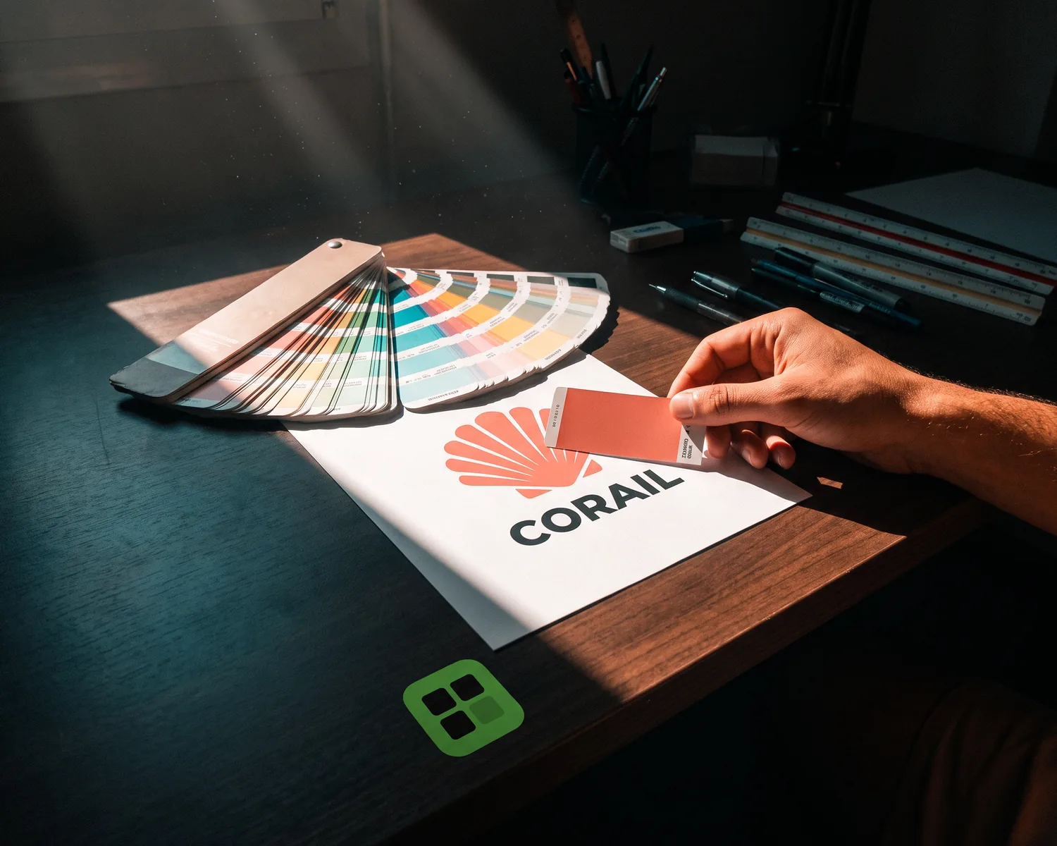
A Pantone color is a premixed ink with a unique reference (for example “286 C”) that any printer can match exactly. For a logo, it guarantees the same color on every surface. To find yours, check your brand guidelines, ask the logo’s designer, or have your printer match it on a swatch book.
What is a Pantone color?
A Pantone color is a shade from the Pantone Matching System, a catalog of numbered references where each number stands for an exact ink recipe. Your printer doesn’t rebuild the color from other inks: they mix the ink to the recipe and print it as is. Print shops call this a “spot color”.
The system comes as a fan deck of paper strips, because a printed color has to be judged on paper, not on a screen. You can browse references with the Color Finder on pantone.com, but what your monitor shows is only a close approximation.
How is Pantone different from CMYK?
Pantone and CMYK differ in one key way: CMYK builds a color out of four inks, Pantone delivers it ready-made. In CMYK printing (also called four-color process), the press lays down tiny dots of cyan, magenta, yellow and black, and your eye blends them. That’s why the result shifts slightly from one press, paper or print run to the next.
With Pantone, a single ink goes down as a solid area, so the color no longer depends on a pattern of dots. It can also reach shades the four inks can’t, such as neon, gold, silver and some very bright oranges. How screen colors become ink colors is a separate topic, covered in our CMYK vs RGB guide.
| CMYK (four-color process) | Pantone (spot color) | |
|---|---|---|
| How the color is made | Dots of four inks blended by the eye | One ink mixed in advance |
| From one run to the next | Small shifts possible | Very consistent |
| Neon, gold, silver | Out of reach | Possible |
| Price | Part of standard printing | One extra ink to prepare |
| Best for | Photos, full-color documents | Logos, solid areas, screen printing |
How do you find your logo’s Pantone color?
To find your logo’s Pantone color, look for something in writing first, then for someone who owns a swatch book. In this order:
- Your brand guidelines or the handover folder from when the logo was made: the Pantone reference is often listed next to the CMYK, RGB and hex codes.
- The designer, the agency, or the printer who did your last business cards: the reference may be sitting in an old quote or order history.
- The original file itself: an AI, EPS or PDF file opened in Illustrator lists its named colors in the Swatches panel, where a “PANTONE 286 C” swatch is easy to spot.
- A physical swatch book: your printer holds the fan deck against something already printed (a card, a sign, a t-shirt) and picks the closest match in daylight.
Can you get a Pantone from a hex code or an image?
A hex or RGB code only gives you an approximate Pantone, never a guaranteed match. Online converters and the Color Finder suggest the closest reference, which is a fine starting point. But the color in a JPG depends on the screen it was made on and on compression: the eyedropper measures a file, not the ink you have in mind. To read the hex code and a CMYK estimate of your logo, drop it into our image color picker: you’ll have precise codes to show your printer.
Treat that suggestion as a lead, then have your printer confirm the reference on a paper swatch before the full run. A vector file of your logo (a file that describes the artwork with outlines and solid fills instead of pixels) makes this much easier: each color is a clean solid area the print shop can assign to the chosen ink.
What do C, U and TCX mean after a Pantone number?
The letters after a Pantone number tell you what surface the color was measured on. C (coated) means smooth, often glossy paper; U (uncoated) means matte paper, where the same ink looks softer and duller. The TCX and TPX suffixes belong to Pantone’s fashion and home system, designed for dyeing fabric.
In practice, 286 C and 286 U are the same ink with a different look. Give your printer the reference that matches your paper, or both if you print on both.
When does a logo need a Pantone color?
A logo needs a Pantone color when its color is part of the brand and has to look the same everywhere. Typical cases:
- you work with several suppliers (cards, signage, vehicle wraps, apparel) and want one single color across all of them;
- your color is outside what CMYK can print: neon, metallic, or a very saturated blue;
- the logo prints in one or two solid colors, as in screen printing, where every color is a separate ink anyway;
- you order large quantities, where consistency matters more than the cost of mixing one ink.
When is Pantone a waste of money?
Pantone is a waste of money when the design already contains photos or gradients: it has to go through CMYK anyway, and an extra ink adds cost nobody will see. The same goes for a small, low-stakes print run, like a flyer for a neighborhood event: the slight CMYK shift won’t be noticed.
Screens don’t use Pantone at all: they work with light and RGB codes. Embroidery doesn’t use ink either: your embroiderer picks the closest thread from their thread maker’s color range. If your logo is going on a patch, our guide to custom embroidered patches covers the rest.
How do you give your printer a Pantone reference?
To give your printer a Pantone reference, write out the full code (number and letter, for example “286 C”) in your message and attach a vector file where each color is a separate solid area. The print shop then links each area to its ink. If you don’t know the reference, just say so: most shops offer to match it against their swatch book, sometimes with a proof to approve.
Everything else to check before sending (format, text, background, size) is gathered in our guide to preparing a print-ready logo.
A one-color version, ready for your Pantone ink
Plenty of orders use a single ink: a rubber stamp, a one-color screen-printed tote bag, a promotional pen. For those, the print shop needs your logo reduced to one shade, which they then print in your Pantone. Depixelise makes that single-color version for you, so there’s nothing to redraw, and bundles it with three other files: the SVG for the print shop, a see-through PNG 2000 pixels wide, and a negative version for dark backgrounds. It accepts a PNG, JPG, WebP or SVG file up to 10 MB and shows you the converted logo full size. The files come to you by email. It’s 100% free, there’s no account to create, and no watermark ends up on your files. On a two-color logo, still check that the text stays readable once everything is merged into one shade.
FAQ
Can a logo use more than one Pantone color?
Yes, a logo can use several Pantone colors, with one reference per solid color. Since each Pantone is a separate ink, it adds a screen in screen printing and setup on an offset press, so most logos stick to one or two.
Is the Pantone swatch book free?
No, the Pantone swatch book isn’t free: Pantone sells its paper fan decks, and the digital library requires a subscription (Pantone Connect), including inside Illustrator and Photoshop. The Color Finder on Pantone’s website is free to browse, and your printer almost always has their own swatch book.
How much does a Pantone color add to a print job?
The cost of a Pantone depends on the shop, the printing method and the quantity: the ink has to be mixed and takes up a station on the press. Ask for two quotes, one in CMYK and one with your Pantone, and compare the price per piece.
Do you need a Pantone to trademark a logo?
No. A trademark application, such as one filed with the USPTO in the US, doesn’t require a Pantone number: you file the logo as it is, and if you claim color, you describe it in plain words. Keeping the reference in your brand guidelines is still useful for every print order.
Can heat transfer vinyl match a Pantone exactly?
Heat transfer vinyl can’t match a Pantone exactly: it comes in a fixed range of colors set by its manufacturer. Your print shop picks the closest shade to your reference; if the color is critical, ask for screen printing, where the ink is mixed to order.