Screen Printing a Logo: Colors, Screens and the Right File
One color, one screen: which logos screen print badly, why dark shirts need an underbase, and the exact file to send your screen printer.
By Gaël Pons
Published , updated
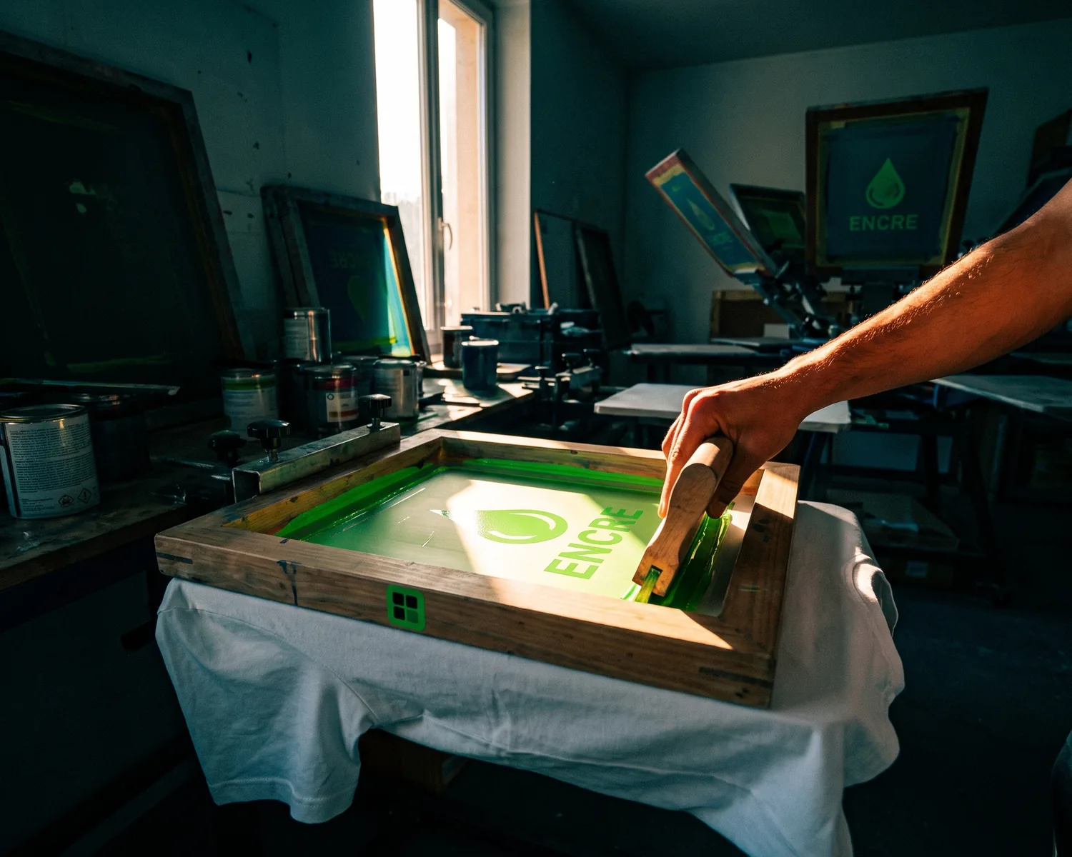
Screen printing puts your logo on fabric one color at a time, each through its own screen, so every extra color adds to the setup cost. To print a logo cleanly, a screen printer needs a vector file (artwork stored as outlines and fills instead of a grid of colored pixels), solid colors and, ideally, Pantone references.
How does screen printing a logo work?
Screen printing a logo works like a stencil: ink is pushed through a fine mesh stretched on a frame, the screen, only where the design has been left open. To make that screen, the shop coats it with a light-sensitive emulsion, exposes it under a film printout of your logo, then washes it out, so only the logo areas still let ink through. A squeegee then drags the ink across the screen onto each shirt.
You can spot the result right away: bold, opaque colors, crisp edges and some of the best wash durability of any decoration method.
Why does screen printing charge by the number of colors?
Screen printing charges by color because every color in your logo needs its own screen, its own registration on the press and its own pass of ink. A black and red logo takes two screens; on a navy hoodie it usually takes a third, for the white underbase.
Those screens are made once for the whole run. On ten shirts they weigh heavily on the price of each one; on a few hundred they nearly vanish. That’s why a screen printing quote comes in two parts: setup, priced per color, and printing, priced per piece.
| Your logo | On press | What to do |
|---|---|---|
| 1 to 3 solid colors | Ideal | Nothing to change |
| 4 colors or more | Doable, each screen adds to the quote | Merge colors that are close |
| Gradient or drop shadow | Printed as a halftone dot pattern | Swap it for solid colors, or go DTF |
| Photo | Hard to get right on fabric | Choose DTF instead |
Which logos don’t screen print well?
The logos that screen print badly are the ones built on subtle shading: gradients, drop shadows, transparency effects and photos. Tiny details cause trouble too, because the screen is a mesh: a very small opening barely lets ink through, and lines set too close together fill in.
The usual suspects:
- gradients, turned into dots of varying size that look grainy on a t-shirt;
- hairlines and tiny lettering, which clog or thicken on press;
- two nearly identical colors, like two neighboring blues: you pay for two screens to get a difference nobody will notice;
- a white box around the logo, printed as a rectangle if nobody removed it from the file.
Simplify the logo yourself rather than letting the shop decide for you: that way you choose what goes.
What file should you send for screen printing?
For screen printing, send a vector file (PDF, SVG, EPS or AI) on a transparent background, with all text converted to outlines and every color labeled with its Pantone number. Add the garment, its color and the print size you want. Not sure which format? Here is how SVG, EPS and PDF compare.
- Vector, not JPG. The film used to burn the screen is output from clean shapes; an enlarged pixel image leaves stair-step edges on it, and your printer will bill you for art cleanup. Here is why every print shop asks for a vector file.
- Pantone references. The printer mixes each ink by hand, and a Pantone number tells them exactly which green to mix. See how to find your logo’s Pantone color.
- Text as outlines. If the font isn’t installed at the shop, their software swaps in another one. Our checklist for a print-ready logo covers fonts along with the other common traps.
What is color separation in screen printing?
Color separation in screen printing means splitting the logo into one layer per ink: each layer becomes a film, then a screen. In a vector file with solid colors, the job is quick, since you just group every shape of the same color. In a JPG, the logo has to be redrawn first.
Many shops do the separations themselves. A file that is already separated, with one layer per color named after its Pantone number, still speeds things up and avoids surprises. Printers also add a slight overlap (called trapping) where two colors meet, so no thin line of fabric shows through if one pass shifts a hair.
Do dark shirts need a white underbase?
Yes, a dark shirt usually needs a white underbase in screen printing, printed first so the fabric doesn’t swallow your logo’s colors. That’s one more screen on the quote. If your logo can work entirely in white, a white version for dark backgrounds prints with a single ink and no underbase. Before you order, preview that one-color version on a black or navy shirt: a dark single-color logo switches to white automatically.
Screen printing, DTF or heat transfer vinyl: which should you pick?
Choosing between screen printing, DTF and heat transfer vinyl comes down to quantity first, then to the number of colors in your logo. Screen printing wins on runs of several dozen pieces with few colors; DTF (direct-to-film, a digitally printed transfer) handles small orders, colorful logos and gradients; heat transfer vinyl, cut from colored sheets, suits names, numbers and simple text. Ordering just a handful? Our page on heat transfer vinyl shirts walks through that route.
How do you get an SVG your screen printer will accept?
To get an SVG a screen printer will accept from a plain JPG or PNG, drop the logo into Depixelise: in about ten seconds its shapes are redrawn as clean, solid areas of color, with the background removed. SVG is the format most decoration shops open without a second look, embroiderers and engravers included. The 2000 px transparent PNG that comes with it covers mockups, quotes and your online store. The preview opens large on screen for you to check. Your inbox receives the full pack of four files. It’s 100% free, with no watermark and no account to create.
Two honest caveats: the tool doesn’t know your Pantone numbers, so give those to your printer yourself, and when the original file is tiny, it gets upscaled before its outlines are rebuilt. Zoom in on the lettering and fine details before you send it.
FAQ
What is a screen print transfer?
A screen print transfer is a design screen printed onto special release paper, then applied to the garment with a heat press. It keeps the screen printed look, but the designs can be printed ahead of time and pressed later, one piece at a time.
Can you screen print a logo at home?
Yes, beginner kits exist (frame, emulsion, squeegee, fabric inks), and a one-color logo comes out well after a few test prints. Past two colors, lining up each pass gets hard without a shop’s carousel press, the rotating machine that holds every screen in place.
Plastisol or water-based ink: what’s the difference?
Plastisol ink sits on top of the fabric: it covers well, even on dark shirts, with a slightly thick feel. Water-based ink soaks into the fibers: very soft to the touch and more matte, but less opaque on dark fabric. Your printer will often recommend one or the other based on the shirt color.
How do you wash a screen printed shirt so it lasts?
A screen printed shirt lasts longer if you turn it inside out, wash it cold, skip the dryer and never iron directly on the print. A print that cracks after a few washes usually points to under-curing at the shop, not to how you washed it.
Will the screen printer separate the colors for me?
Yes, most screen printers will separate the colors of a vector file themselves, sometimes for an art setup fee. From a JPG or PNG they have to redraw the logo first, which costs more, so vectorizing before you send it usually takes that line off the quote.