Rich Black CMYK: Values to Use and When to Stick With 100% K
100% K for text and small logos, rich black for big solid areas: example CMYK builds, the registration black trap, and what to ask your printer.
By Gaël Pons
Published
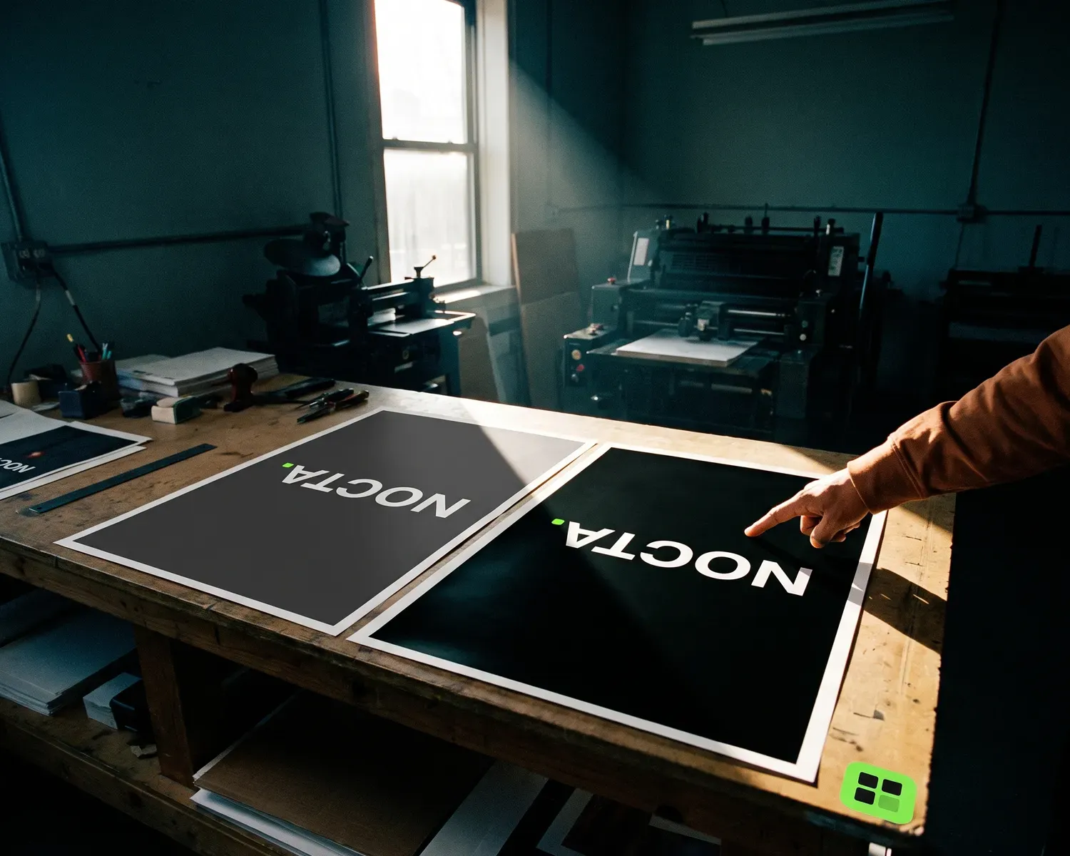
For text, thin lines and small logos, keep pure black: C0 M0 Y0 K100. For a large solid area, ask for rich black in CMYK, which adds cyan, magenta and yellow under the black, using your printer’s own recipe. On screen, the two can look exactly the same.
What is rich black in CMYK?
Rich black in CMYK is black printed with 100% black ink plus a layer of cyan, magenta and yellow underneath, which makes it look darker and denser than black ink on its own. Print shops also call it a 4 color black or a black build. The plain version, C0 M0 Y0 K100, goes by pure black or 100% K: one ink, nothing added.
Each of the four numbers, from 0 to 100%, sets how much of that ink the press lays down in that spot. Why ink can’t always match your screen is a separate topic, covered in our side-by-side look at CMYK and RGB.
When should you use 100% K instead of rich black?
Use 100% K (C0 M0 Y0 K100) for anything thin or small: body text, fine lines, outlines, small print, and logos printed small, like on a business card or a letterhead. A single ink forms every letter, so nothing can slip out of line and the edges stay crisp even under a magnifier.
It’s also the right value when your logo is headed for a one-ink process: a rubber stamp, an engraving, one-color screen printing. Those shops want a one-color version of your logo, where black is a flat solid shade rather than a mix.
Why does 100% K look dull on a big solid area?
100% K looks dull on a big solid area because printing ink isn’t fully opaque: across a wide surface, a little of the white paper shows through and the black drifts toward charcoal gray. On a line of text nobody notices; on a poster background, a book cover or a sign, the gap is obvious.
Putting cyan, magenta and yellow under the black fills those tiny gaps. The area reads deeper and richer, especially next to a photo or a bright color.
What CMYK values make a good rich black?
A good rich black in CMYK keeps black at 100% and, in the published examples below, adds 35 to 70% of each of the other three inks, most often 40 to 50%, but every printer tunes its own build to its presses and paper. Two examples checked on October 14, 2026:
- Wikipedia’s rich black entry gives a typical mix of 100% black with 50% of each of the other three inks (C50 M50 Y50 K100), and a “cool” black at C70 M35 Y40 K100.
- CorelDRAW’s guide to black in CMYK printing suggests C40 M40 Y40 K100 for a dark, neutral black. It adds that color profiles cap total ink between 300% and 340%, and warns never to print with all four inks at 100%.
| Black | C | M | Y | K | Total ink | Best for |
|---|---|---|---|---|---|---|
| Pure black (100% K) | 0 | 0 | 0 | 100 | 100% | text, thin lines, small logos |
| CorelDRAW example | 40 | 40 | 40 | 100 | 220% | large solid areas |
| Typical mix (Wikipedia) | 50 | 50 | 50 | 100 | 250% | large solid areas |
| Cool black (Wikipedia) | 70 | 35 | 40 | 100 | 245% | large solid areas, cooler tone |
| Registration black | 100 | 100 | 100 | 100 | 400% | never in artwork |
Those four numbers added together are your total ink coverage. The golden rule stays simple: ask your printer for their rich black recipe, for the paper you’ve chosen. They’ve already dialed it in for their presses, and their numbers beat any example you’ll find online.
What is registration black, and why should you avoid it?
Registration black is all four inks at full strength, a swatch meant only for the crop marks and alignment marks that every plate has to print. Design apps keep it in their swatch lists (Illustrator names it “[Registration]”), and on screen it looks like the perfect black, which is exactly why people pick it by mistake. On paper it floods the sheet with ink, and CorelDRAW’s guide says never to use it for printing.
Don’t confuse it with a 4 color black: a rich black uses all four inks too, but in measured amounts that stay well under the limit.
What goes wrong with rich black?
Three things tend to go wrong with rich black: small text, too much ink, and black left in RGB.
- Small text in rich black. Each ink is printed by its own plate, and all four have to land exactly on top of one another. If one shifts by a hair, small type or a thin line in rich black picks up a bluish or reddish fringe and looks blurry. Save rich black for big areas.
- Too much ink. A homemade build loaded too heavily can go past your printer’s limit: the extra ink takes longer to dry, which often leads to printing errors. Stick to the numbers they give you.
- Black left in RGB. A black logo saved for screens (#000000) and then converted by an app’s color profile often turns into a four-ink mix that is neither a crisp pure black nor a controlled rich black. “File is RGB” also happens to be one of the most common reasons a printer rejects a file.
Black is only one setting to get right: format, transparent background, outlined text and extra versions are all covered in our checklist for a print-ready logo.
How do you set rich black in Illustrator or Affinity Designer?
To set rich black in Illustrator or Affinity Designer, select the shape you want to fill and type in the four values your printer gave you. In Illustrator, switch the Color panel to CMYK from its menu, then enter the numbers. In Affinity Designer, the Color panel offers CMYK sliders with boxes where you type each value. Then save the color as a swatch, so it’s applied the same way everywhere.
This only works on a vector file, where your logo is stored as shapes rather than little colored dots, and each solid area carries one color you can change in a click. In a JPG or PNG, the black is spread over thousands of pixels and can’t be adjusted cleanly.
If your brand guidelines call for a Pantone black, the CMYK recipe no longer applies: the ink arrives premixed, as our guide to finding your logo’s Pantone colors explains.
Pure black for your logo, with nothing to redo
Our RGB to CMYK converter turns #000000 into C0 M0 Y0 K100, and that’s deliberate: for a logo, a single ink keeps the edges sharp, with no risk of the plates drifting apart. If that logo ends up filling a big solid area, your printer will swap in their rich black build. Type in your other HEX or RGB codes and the CMYK estimate appears instantly, ready to copy in one click, free and with no sign-up. A warning shows when a color is too bright to print without dulling. That CMYK is an estimate for offset printing on coated paper: your printer’s profile is the one that counts.
If all you have is an image of your logo, Depixelise turns it into a vector file, 100% free. Among the files sent by email, the one-color version (your logo reduced to a single solid color) is the right starting point for a crisp pure black.
FAQ
Is “true black” in CMYK the same as rich black?
“True black” in CMYK is not always rich black: it isn’t a standard printing term, and people use it for rich black as well as for plain 100% K. Give your printer the four numbers rather than the name, and ask which black they mean.
Why do rich black and 100% K look the same on my screen?
Rich black and 100% K can look the same on screen because your monitor only simulates ink, and each design app decides how to display black; Illustrator even has an Appearance of Black setting in its preferences for this. Only a printed proof shows the real difference on a large area.
Does rich black work on uncoated paper?
Rich black needs adjusting on uncoated paper: thin, absorbent or uncoated stock soaks up more ink than coated paper, so printers often lighten their build for it. That’s why you ask for the recipe for one specific paper, not once and for all.
Do you need rich black on a T-shirt?
A T-shirt usually doesn’t need rich black, because on fabric black doesn’t come from mixing inks the way it does on paper: screen printing uses a dedicated black ink, heat transfer vinyl uses black film, and with DTF the shop’s print software handles black on its own. Send your logo in pure black and read how screen printing handles a logo one ink at a time.
What should you tell your printer if you don’t know their black recipe?
If you don’t know your printer’s black recipe, send the file with black set to C0 M0 Y0 K100 and write: “Can you apply your rich black to the large solid area and keep the text in 100% K?” They’ll swap in their own values or tell you what to enter.