Monochrome Logo: How to Make a One-Color Version
What a monochrome (one-color) logo is, why grayscale isn't the same thing, where you need one, and how to get a single color logo for free.
By Gaël Pons
Published
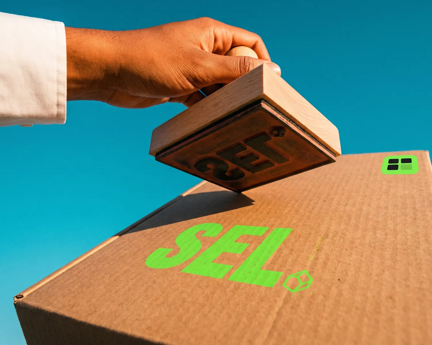
A monochrome logo, also called a monochromatic, one-color or single color logo, is your logo in one solid ink: no gradients, no shadows, no shades of gray. It’s the file an engraver, a rubber stamp maker or a single-thread embroiderer expects.
What is a monochrome logo?
A monochrome logo is a version of your logo where every shape is filled with the same ink at full strength, on a transparent background. Each spot is either inked or empty, nothing in between: no tints, no partial transparency, no highlights.
You’ll hear it called a “one-color logo”, “single color version” or “mono version”. Black is the usual choice, but a monochromatic logo can just as well be navy, red or gold. What matters is that there’s only one.
When do you need a one-color logo?
You need a one-color logo whenever the marking method can only lay down one material at a time. The usual suspects:
- laser engraving on wood, metal, glass or leather: the laser either marks the surface or it doesn’t;
- rubber stamps: the stamp leaves ink or nothing;
- single-color embroidery on a cap or polo, where the whole logo uses one thread (see our logo embroidery guide for the other settings);
- one-color screen printing, where each color needs its own screen, so a mono logo is cheaper to run (more in screen printing a logo);
- vinyl cutting for decals and vehicle lettering, when a single vinyl is planned;
- embossing and foil stamping on paper or leather, which can’t show any shading;
- photocopies and paperwork printed in black only.
For engraving and cutting, some shops also ask for a DXF; that format is explained in what a DXF file is.
Monochrome vs grayscale vs black and white: what’s the difference?
A monochrome logo has one solid color, while a grayscale logo holds dozens of grays from pale to black. The first can be engraved, stamped or stitched as is; the second looks like a black-and-white photo and causes trouble as soon as the machine can’t do gray.
Here’s the classic trap: you open the logo in Photoshop, choose Image > Mode > Grayscale, and think you’re done. You aren’t. Your red turns into a mid gray, your yellow into a faint gray, and the stamp maker now has to guess which grays become black and which ones disappear.
In print, those grays are actually faked with a pattern of tiny black dots. On a stamp or an engraving, that pattern looks dirty and grainy, and sometimes can’t be read at all.
How do you make a monochrome logo in design software?
Making a monochrome logo is quick if you start from a vector file, meaning a file that describes shapes rather than storing a grid of tiny colored squares. Open it in Illustrator or Inkscape, select everything, give every shape a black fill, remove shadows and gradients, then export as SVG and PDF.
With a JPG or PNG, the cleanest route in Photoshop is Image > Adjustments > Threshold: every pixel becomes either black or white, and you slide the control until all the lettering survives. The result is still a pixel image, with jagged edges if the original was small, so it will need converting to vector before engraving or embroidery.
Why do details vanish when a logo goes one color?
Details vanish when a logo goes one color because, in the original, some shapes were only told apart by their color. Yellow text on a blue circle, a green leaf touching a red apple: once everything is black, the two shapes merge into one blob and the text is gone.
There are three ways to fix it:
- knock out the top shape so it shows in the color of the material (the text becomes an empty space inside the black circle);
- separate the two shapes with a thin gap so they stay readable side by side;
- drop the secondary element if it adds nothing at small sizes.
The first fix is the most common on stamps and engravings. It looks a bit like a white logo for dark backgrounds, but it’s a different file: the negative is white and goes on dark surfaces, the monochrome is dark and goes on light ones.
Where can you get a one-color logo without redoing it?
A one-color logo comes ready-made when you convert your logo with Depixelise, so you don’t have to recolor every shape by hand. Drop your logo onto the upload area (a PNG, a JPG, a WebP or an SVG, with a 10 MB ceiling). Roughly ten seconds on, the vectorized version fills the screen beside the original, so you can look at it closely. By email, you receive the single-ink version, ready for an engraver or a stamp maker, plus three more files: the full-color SVG, a transparent 2000 px PNG and the negative for dark fabric. You won’t create an account or find a watermark, and the whole thing is 100% free. One thing to check: if your logo has two colors touching each other, zoom in on the mono file to make sure no word has merged into its neighbor.
What color should a monochrome logo be?
The color of a monochrome logo depends on where it goes: black by default for stamps, photocopies and paperwork, your main brand color for screen printing and embroidery. For laser engraving the question doesn’t arise, since the material itself sets the shade.
If you’re screen printing and need an exact color, give the shop a swatch reference rather than a screen color code. How that works is covered in Pantone colors for a logo.
FAQ
Does a monochrome logo have to be black?
No, a monochrome logo can be any color, as long as it uses only one, with no shading. Black is simply the most requested version, because the shop can also use it as a base to apply whatever ink or thread you choose.
Can a gradient survive in a single color logo?
No, a gradient can’t survive in a single color logo. Replace it with a flat fill, or with crisp bands or dots if the effect is essential to the design. Drop shadows and highlights are removed the same way.
How can you tell if a logo will work in one color?
To tell if a logo will work in one color, print it in black, small, on plain paper. If you can still recognize every letter and the symbol at arm’s length, it will work on a stamp or an engraving. If part of it turns into a blob, plan a knockout or a gap.
Does a monochrome logo replace the color logo?
No, a monochrome logo sits alongside your color logo, it doesn’t replace it. A well-equipped brand keeps at least three versions (full color, one color and negative), each as a vector file and as a PNG.